Painting Death Korps
Happy New Year
First of all, thanks to everyone for the last year and here's looking forward to another belter. Among the new projects lurking in the wings is an English Civil War army and a Mordheim Warband.
A few weeks ago, I shared some of my thoughts on starting a Death Korps of Krieg army. With the models here and my holiday in full swing, I decided to make a start with building and painting.
Construction
I bought some of these models off Ebay, and they arrived loose in a small plastic money bag. There was nothing wrong with the quality, but they had all been removed from the sprues and it was impossible to tell which arm fitted to which lasgun or body. Only by tortuously laying out every torso, left arm and right arm could I try every permutation until they fitted, and even then I had to use lots of Green Stuff.
I saved about £5 by buying second hand off Ebay; although I've only had good experiences (with various sellers) buying GW stuff, but for FW it's a bit of a false economy. I'll be sticking with proper FW stuff to minimise the risk in future.
 |
| The first effort. I don't like him - although he 'went well' and the quality is okay, the scheme just didn't grab me. |
Painting
This is where the controversy creeps in. In keeping with the Germanic theme, I originally went for a field-grey scheme. In fact, I used exactly the same process as with my WWI German Stormtroopers. But I just wasn't happy - I can't really say why, the test model above looks fine but I really wasn't 'feeling it' as they say.
Reluctantly, I chalked the three command squad models I'd already painted up to experience, and went back to the drawing board.
I wanted something a bit different, something that broke away from the heavy German stereotype. In the end I decided on brown - I'd had good results with washes and inks on my Russians, as well as the cloaks of my Priest and Psykers. I also made heavy use of mud, inks and powders.
 |
| Coy HQ Honour Guard |
 |
| Company Standard |
 |
| Detail of the camo helmet |
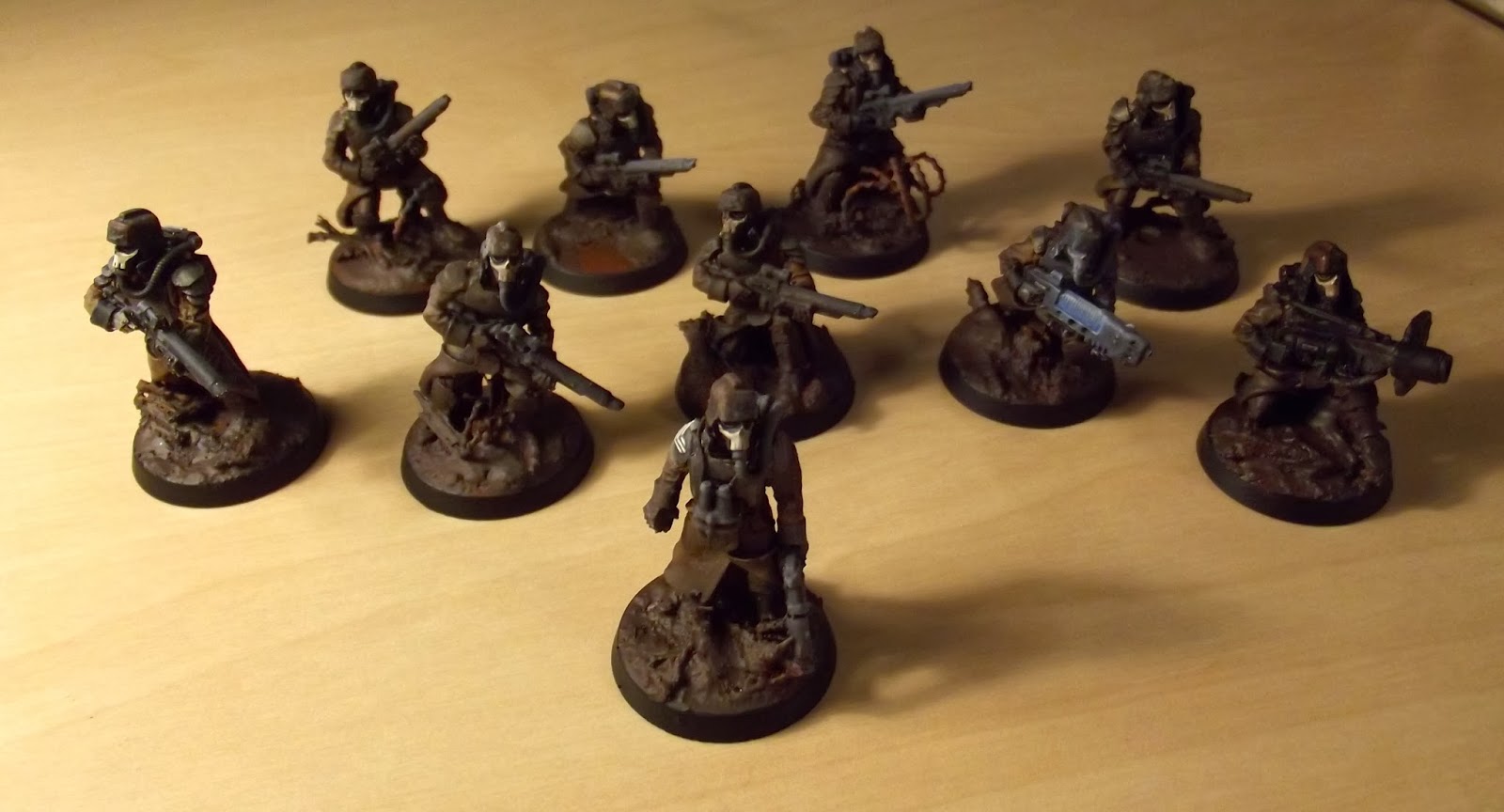 |
| The Grenadier Squad |
 |
| Squad sergeant - I was keen to avoid the sword- waving lunatic and have a nice simple pistol |
 |
| A Plasma Gunner with some rudimentary OSL |
I was much happier with these results, and they were a lot quicker to paint:
- Bestial Brown Base
- Black Wash
- XV-88 Highlights
- Brown Wash
The Black and Metal areas simply got a level basecoat between steps one and two, then the two washes shaded them with no need for more highlighting.
I then used Stirland Mud texture paint (very) liberally on the base and the model to give a battle-worn, muddied effect as befits a mining unit.
I then used Stirland Mud texture paint (very) liberally on the base and the model to give a battle-worn, muddied effect as befits a mining unit.
So I'm a little disappointed to have wasted those nice command squad models - with hindsight I should have got some dusty old second-hand DKoK to try colour schemes out on. But the end result is a colour scheme I'm pleased with!
Thanks for reading
Ed


There are ways of safely stripping FW resin if you do a bit of Internet research - they aren't totally wasted!
ReplyDeleteI was so resigned to their fate I didn't even search... thanks for the tip!
DeleteExcellent ! They look good so far, I will dig out those weapon carriages soon.
ReplyDeleteCheers mate, there may be a detachment ready for March...
DeleteThose look official.
ReplyDeleteVery nice!
Thanks SinSynn, very good of you. I'm looking forward to being able to share the whole army...
DeleteThese look bloody gorgeous sir, and I can vouch that what I've seen so far looks even better in person. Looking forward to facing them on the table my good man, and possibly for once allying with them!
ReplyDeleteThat'll be odd, we do always seem to end up on opposite sides don't we? Thanks for the comment.
DeleteI must admit I have been, possibly a little too eagerly, to see what was to appear with the first batch of DK and you have not disappointed at all sir! Really lovely work on them ^^
ReplyDeleteAh, many thanks your Royal Highness, I'm glad I managed to decide to scrap the first three because I'm much happier with the second scheme.
DeleteCheers Liam, that was a straight lift from my WWI German Stormies, they looked quite good there and it brings a small splash of colour to the brown. The first scheme was also, as you say, lacking in originality a bit as well.
ReplyDeleteWow!
ReplyDeleteI loved the first one but I REALLY love the look of the squad...and that helmet is - frankly - beautiful! Nice work!
Thankyou Drax, always nice to hear your feedback - glad you like the helmets, they seem to have gone down well. A worthwhile flash of inspiration.
DeleteNice to see you get on with these Col. Very much like the scheme you ended with - you've executed it wonderfully. Your painting really has come along well since I first started following your blog.
ReplyDeleteAs to the DKK - I always raised an eyebrow when people remark that they are WW1 german-inspired, as to me, they seem far more French of Belgian styled than Imperial German. I know you were more referring to the scheme in general, but I thought I'd just blurt it out seeing as I'm bored during lunch..... ~_~
Dettol I think strips resin okay?
Thanks Dai, yes that's the advantage of a blog, apart from picking up other techniques you can chart your own progress far more effectively than by memory alone.
DeleteAs for the whole French-German dilemma, I think you're right there. People more educated than me (Kieran) have mentioned that to me before, I think it's the helmets that make me think German more than anything else. Cursory Google research confirms you're right, of course!
Funny you say that as I've always said I would paint them in horizon blue if I ever got any. But I like the brown as it suits the Sapper and Miner / Pioneer theme methinks. I think it's the helmet that makes them look Germanic overall.
DeleteIf I recall dettol is fine on resin, definitely plastic, but I'd double check that before any of those lovely minis goes anywhere near the pine scented stuff
Haha we managed to post the same thing at the same bloody time
DeleteI would definitely say the FW influence was WWI Germans overall though, perhaps with the French-style greatcoat thrown in just to make it different enough
DeleteFrench from the neck down then (and call it quits! :P).
DeleteKind of makes me want to grab a squad just so I can paint them up, early WW1 colours of blue coats and red trousers! Try hiding in that!
They'd work quite well in Palladian colours....
DeleteI haven't checked in with this blog in a while; one of my resolutions in 2014 is to be a better citizen of the wargaming blogosphere. I can't imagine all the patience it took to lay all those bits out and figure exactly what you had. Well done. The paint scheme for these sombre chaps looks convincing.
ReplyDeleteBest in 2014,
Michael
It was quite a challenge! Thanks a lot Mike, and hopefully there will be more interesting stuff in the year to come.
DeleteNo idea how I missed this one - I am absolutely blown away by how those turned out! I really dig the brown scheme, it warms up the models quite a bit and really gives them a 'lived-in' look.
ReplyDeleteSuperlative work, man!
Cheers mate - it took a lot of guts to slop all that mud over those lovely uniforms but I'm glad I did it in the end.
Delete